CSS Gradient Mask Layers
CSS gradients can also be used as the mask layer image.
Linear Gradient Mask Layer
Here, we use a linear gradient mask layer for our image. This linear gradient goes from top (black) to bottom (transparent):
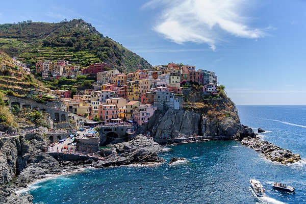
Example
    .mask1 {
  -webkit-mask-image: linear-gradient(black, transparent);
  mask-image: linear-gradient(black,
    transparent);
}
Here, we use a linear gradient along with text masking as the mask layer for our image:
Cinque Terre is a coastal area within Liguria, in the northwest of Italy. It lies in the west of La Spezia Province, and comprises five villages: Monterosso al Mare, Vernazza, Corniglia, Manarola, and Riomaggiore.
Cinque Terre is a coastal area within Liguria, in the northwest of Italy. It lies in the west of La Spezia Province, and comprises five villages: Monterosso al Mare, Vernazza, Corniglia, Manarola, and Riomaggiore.
Example
    .mask1 {
  max-width: 600px;
  height: 400px;
  background: url(img_5terre.jpg) no-repeat;

    -webkit-mask-image: linear-gradient(black, transparent);

    mask-image: linear-gradient (black, transparent);
}
Radial Gradient Mask Layer - Circle
Here, we use a radial gradient (shaped as a circle) as the mask layer for our image:
Example
    .mask2 {
  -webkit-mask-image:
    radial-gradient(circle, black 50%, rgba(0, 0, 0, 0.5) 50%);

    mask-image: radial-gradient(circle, black 50%, rgba(0, 0, 0, 0.5) 50%);
}
Radial Gradient Mask Layer - Ellipse
Here, we use a radial gradient (shaped as an ellipse) as the mask layer for our image:
Example
    .mask3 {
  -webkit-mask-image: radial-gradient(ellipse, black 50%, rgba(0,
    0, 0, 0.5) 50%);
  mask-image: radial-gradient(ellipse, black 50%, rgba(0, 0,
    0, 0.5) 50%);
}
Conic Gradient Mask Layer
Here, we use a conic gradient as the mask layer for our image:
Example
    .mask3 {
  -webkit-mask-image: conic-gradient(black 0deg,
    transparent 360deg);
  mask-image: conic-gradient(black 0deg, transparent
    360deg);
}
CSS All Masking Properties
The following table lists all the CSS masking properties:
| Property | Description |
|---|---|
| mask-clip | Specifies which area is affected by a mask image |
| mask-composite | Specifies a compositing operation used on the current mask layer with the mask layers below it |
| mask-image | Specifies an image to be used as a mask layer for an element |
| mask-mode | Specifies whether the mask layer image is treated as a luminance mask or as an alpha mask |
| mask-origin | Specifies the origin position (the mask position area) of a mask layer image |
| mask-position | Sets the starting position of a mask layer image (relative to the mask position area) |
| mask-repeat | Specifies how the mask layer image is repeated |
| mask-size | Specifies the size of a mask layer image |
| mask-type | Specifies whether an SVG |
