The CSS mask-image Property
CSS masking allows you to create a mask layer to place over an element to partially or fully hide portions of the element.
The CSS mask-image property specifies a mask layer image.
The mask layer image can be a PNG image, an SVG image, a CSS gradient, or an SVG
Use a PNG Image as the Mask Layer
To use a PNG image as the mask layer, use a url() value to pass in the mask layer image.
The mask image needs to have a transparent or semi-transparent area. Black indicates fully transparent.
Here is the mask image ("w3logo.png") we will use:
Here is an image from Cinque Terre, in Italy:
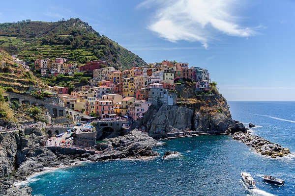
Now, we apply the mask image as the mask layer for the image from Cinque Terre, Italy:
Example
  .mask1 {
  -webkit-mask-image: url(w3logo.png);
  mask-image:
  url(w3logo.png);
  mask-repeat: no-repeat;
}
The mask-image property specifies the image to be used as a mask layer for an element.
The mask-repeat property specifies if or how a mask image will be repeated. The no-repeat value indicates that the mask image will not be repeated (the mask image will only be shown once).
Repeat the Mask Layer Image
If we omit the mask-repeat property, the mask image will be repeated all over the image from Cinque Terre, Italy:
Example
  .mask1 {
  -webkit-mask-image: url(w3logo.png);
  mask-image:
  url(w3logo.png);
}
Position the Mask Layer Image
The mask-position property sets the starting position of a mask image (relative to the mask position area). By default, a mask image is placed at the top-left corner of an element, and repeated both vertically and horizontally.
Here, we position the mask image in center:
Example
  .mask1 {
  -webkit-mask-image: url(w3logo.png);
  mask-image:
  url(w3logo.png);
  mask-repeat: no-repeat;
  mask-position:
  center;
}
CSS All Masking Properties
The following table lists all the CSS masking properties:
| Property | Description |
|---|---|
| mask-clip | Specifies which area is affected by a mask image |
| mask-composite | Specifies a compositing operation used on the current mask layer with the mask layers below it |
| mask-image | Specifies an image to be used as a mask layer for an element |
| mask-mode | Specifies whether the mask layer image is treated as a luminance mask or as an alpha mask |
| mask-origin | Specifies the origin position (the mask position area) of a mask layer image |
| mask-position | Sets the starting position of a mask layer image (relative to the mask position area) |
| mask-repeat | Specifies how the mask layer image is repeated |
| mask-size | Specifies the size of a mask layer image |
| mask-type | Specifies whether an SVG |
