🔥Limited Offer: Get 50% OFFon AI & Full Stack Courses🔥
Back to MongoDB Notes
Topic #27

MongoDB Charts


MongoDB Charts

MongoDB Charts lets you visualize your data in a simple, intuitive way.


MongoDB Charts Setup

From the MongoDB Atlas dashboard, go to the Charts tab.

If you've never used Charts before, click the Activate Now button. This will take about 1 minute to complete.

You'll see a new dashboard. Click the dashboard name to open it.


Creating a Chart

Create a new chart by clicking the Add Chart button.

Visually creating a chart is intuitive. Select the data sources that you want to use.


Example:

In this example, we are using the "sample_mflix" database loaded from our sample data in the Intro to Aggregations section.

Under Data Source, select the Movies collection.

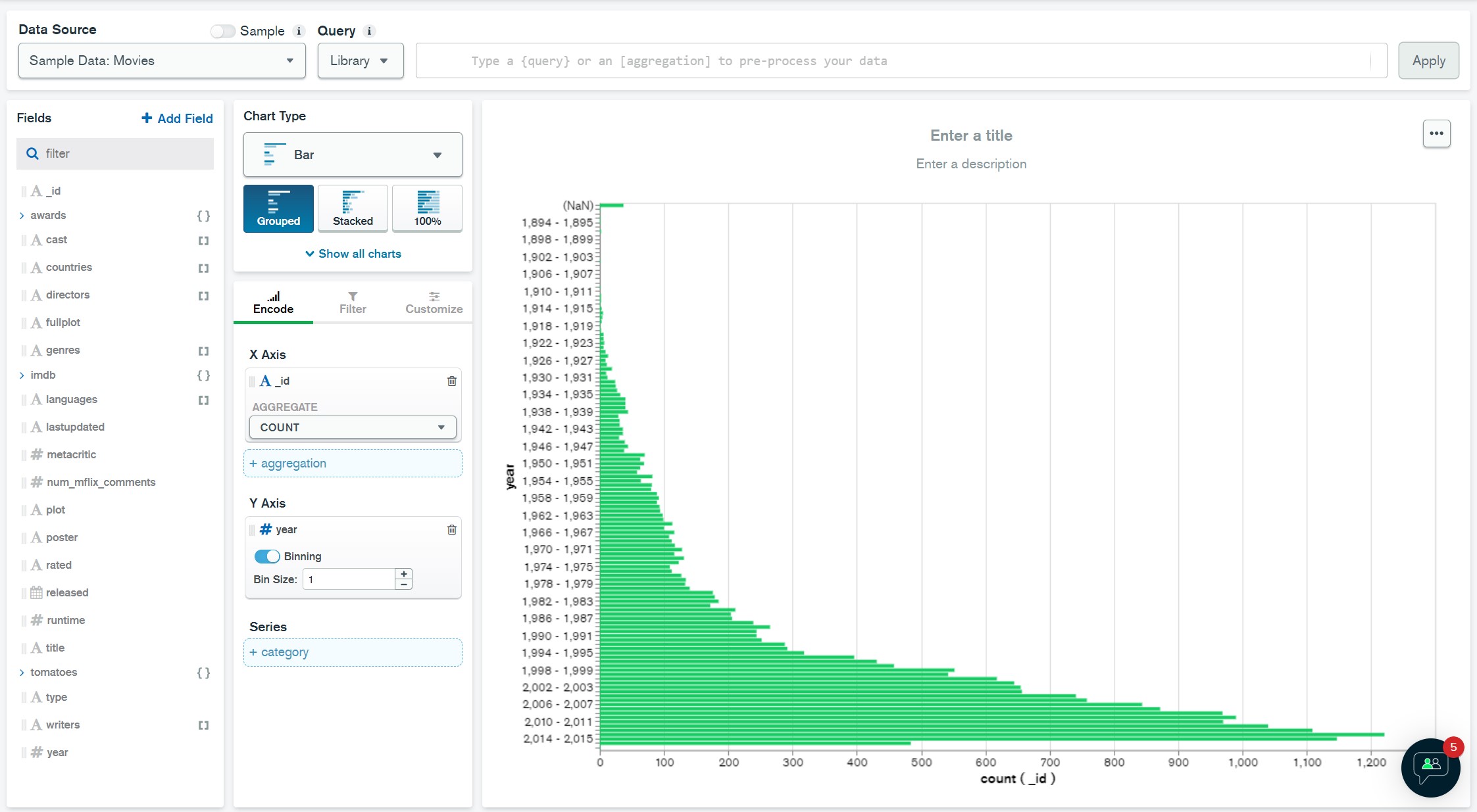
Let's visualize how many movies were released in each year.

Drag the Year field to the Y Axis field and set the Bin Size to 1.

Drag the _id field to the X Axis field and make sure COUNT is selected for the Aggregate.

You should now see a bar chart with the number of movies released in each year.
image

Want to go beyond the notes?

Join CodingNow 2.0's MongoDB course — live mentorship, real projects, and 100% placement support.

Enroll Now — Free Demo Available

MongoDB Charts – FAQs

Quick answers about learning MongoDB Charts in MongoDB.

This free note from CodingNow 2.0 explains MongoDB Charts in MongoDB — concept, syntax and worked code examples you can copy, run and revise before interviews.
Yes. Every MongoDB topic on CodingNow 2.0, including MongoDB Charts, is 100% free with no signup required.
With focused practice, most students grasp MongoDB Charts in 1–3 days from these notes; pairing it with CodingNow 2.0's mentor-led course takes you to job-ready depth faster.
Use the code examples in this note, then ask doubts for free on the CodingNow 2.0 Community (/community) — expert instructors answer within 24 hours.
WhatsApp
Call NowEnroll Now
